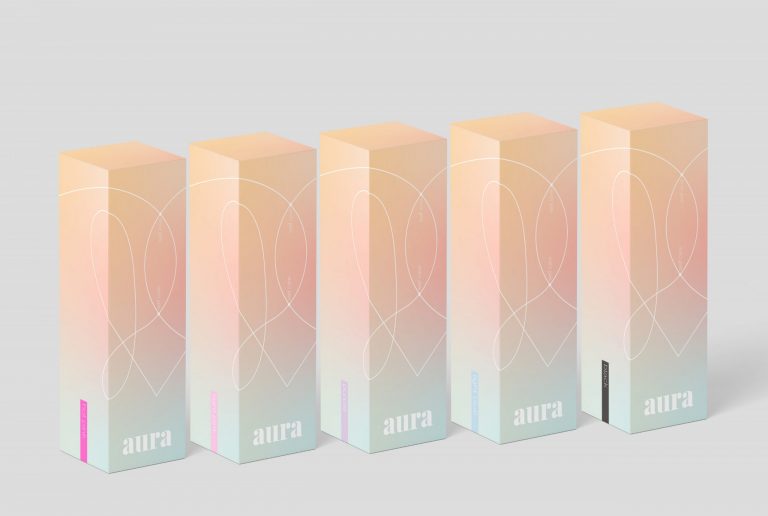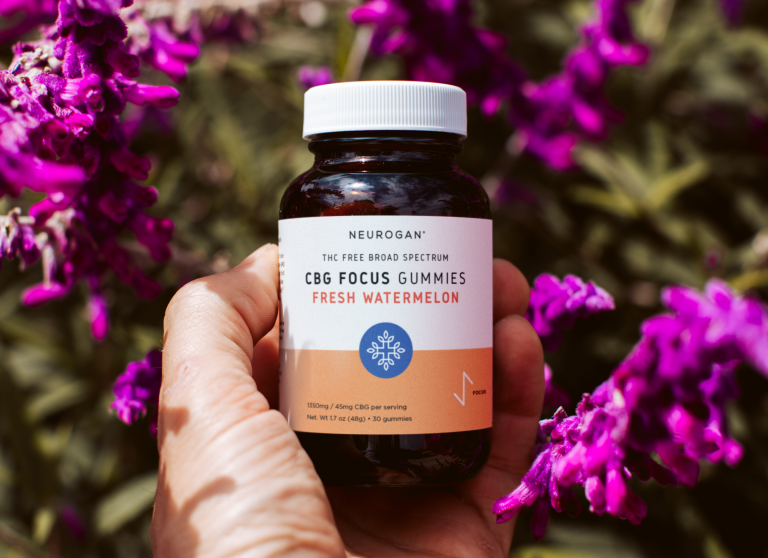

Rebranding
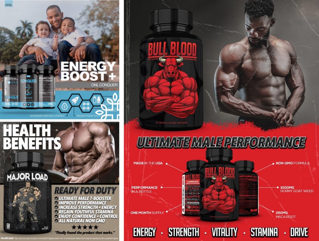
Our goal was to diffuse the line between bodybuilders, weekend warriors, and recreational fitness enthusiasts and depict the supplements as fit for athletes at any level that prefer science-driven, quality formulas, targeting aspects of the mind and body necessary to become their best.


Amazon Listing Images
In order to achieve a clean, mature, and cohesive look, we incorporated repetitive graphic elements, a reduced number of bold colors, and images of athletic people in mid-session who stroke the ideal balance between active, healthy lifestyle and dedicated bodybuilding, thus straying away from the previous “musclemen only” approach. We created clutter-free images that rely on visual spaciousness, incorporating various indoor and outdoor sports environments.


Amazon EBC
Since a brand’s fonts and typography can send a strong message to the customers, we played with different sizes and positions to evoke visual interest that culminated in the desired dynamic aesthetics. We incorporated more strict and sleek geometrical forms that elevated the compositions as a whole, comfortably guiding the eye and stimulating a sense of stability.